|
|
Lesson 4: 20th Century artists who use symmetry to explore color theory, part I |
|
Lesson 1 Ritual Geometry Mandala Lesson 2 Group Elements Color Theory Lesson 3 Groups and Groups Acting on Sets Block printing Lesson 4 Klimt and the Computer Color and symmetry in modern art I Lesson 5 Islam Islamic art Lesson 6 Penrose and Rice Color and symmetry in modern art II Lesson 7 Escher 1 Escher 2 Lesson 8 Hundertwasser & Griffeath Pattern and Modern Painting Brian P. Hoke: Cellular Automata and Art Student's Work

|
Goals:
We will be investigating two contemporary artists, Josef Albers and Sol Lewitt, who are often associated with Minimalist and Conceptual art. [note 1] These artists have employed simple geometric forms and mathematical concepts in their endeavor to reveal the illusory effects of color on the two- dimensional plane.
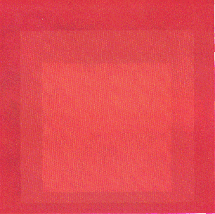
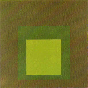
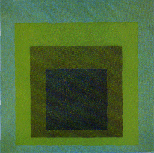
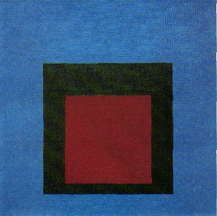
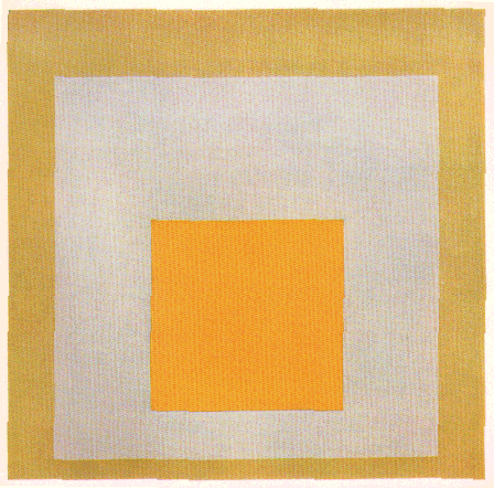
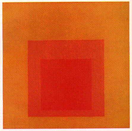
Josef Albers, 1888-1976, GermanThe work of Josef Albers presaged the art of Minimalism and Conceptualism in the 1960s. In his earlier career, Albers was a major figure of The Bauhaus, an influential German school of design and architecture. The Bauhaus developed out of a movement called European Constructivism, a purely abstract, geometric style that emerged shortly before the 1920s. The Bauhaus Constructivists believed that pure abstract forms, such as lines, squares and triangles were more valid than representational painting. For these artists such pure forms evoked a "universal" reality. [note 2] Albers eschewed representation, in favor of the abstract and hard-edged geometric shapes he employed in his most celebrated works. He said "... art should not represent, but present," and preferred the "anonymity of machine-like precision for personal expressiveness." [note 3]
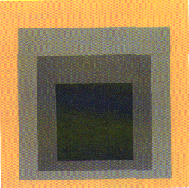
Harry N. Abrams, Inc., New York From the Homage to the Square series, p. 21
Homage to the Square, Interaction of Color
Harry N. Abrams, Inc., New York From the Homage to the Square series, p. 49
Because colors have powerful emotional associations, each combination of colored squares created a distinct psychological impact on the viewer. [note 5] While the squares he used to convey color interaction were simple, hard-edged geometric shapes, Albers saw his paintings as profoundly inventive and more expressive than a representational painting. "When you see how much color helps, hates, penetrates, touches, doesn't that parallel life?"
Harry N. Abrams, Inc., New York From the Homage to the Square series, p. 51-57
Paintings from Homage to the Square are best experienced as a series. Albers is often considered the father of "series" art along with other late modern approaches such as Hard Edge, Minimal art, Op art and Conceptualism.
Sol Lewitt, (American, born 1928)Class visit to see installation by Sol Lewitt at the Hood Museum of Dartmouth CollegeSol LeWitt has been a leading avant garde artist in America since the 1950s. He is known both as a minimalist and a conceptualist who deals with multipart structures. A principle characteristic of conceptual art is that the "'true' work of art is not a physical object produced by the artist but consists of 'concepts' or 'ideas'..." [note 7] Below is the verbal description and xsaccompanying images of Lewitt's wall drawing. Verbal description of installation Prints of Installation Sol LeWtt 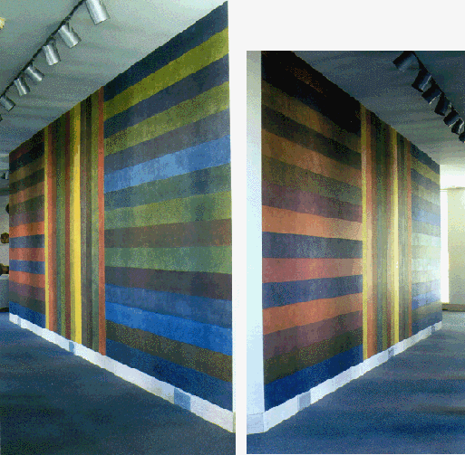
Sol LeWitt made the first of his "wall drawings" in 1968 for an exhibition at the Paula Cooper Gallery in New York, and they have formed an important part of his work since then. Comprised of webs of colored lines or, more recently, of pure geometric shapes such as cubes, pyramids and rectangles, they represent the artist's continuing interest in the mathematical analysis of form. A leading advocate of conceptual art, LeWitt conceived of his wall drawings as detailed sets of instructions that could be executed by an assistant. The hand of the artist is not necessary because, as LeWitt remarked, it is the idea that "becomes the machine that makes the art." The achievement of LeWitt's art lies in his perception of the expressive potential of rational structures. However austere in conception, his wall drawings are not simply analytic in character, but also mysterious, subtle, and sensual. [note 8] (Hood Museum) Footnote
The Oxford Companion to Tentieth-Century Art
The Oxford Companion to Tentieth-Century Art
The Oxford Companion to Tentieth-Century Art
The Oxford Companion to Tentieth-Century Art
The Oxford Companion to Tentieth-Century Art
Daniel Wheeler: Art since mid-century: 1945 to the present
Daniel Wheeler: Art since mid-century: 1945 to the present Minimal art taken up by the critic Barbara Rose in 1965: art works which [have] an unsually low degree of differentiation e.g. uniformly painted monochromatic canvases, and therefore a mimimal amount of 'art-work' on the part of the artist. Oxford Companion to 20th Century Art. p. 376.
How do these minimalist/conceptual works affect you? Do you value experiencing a work of art that rests on 'concept', rather than a physical essence?
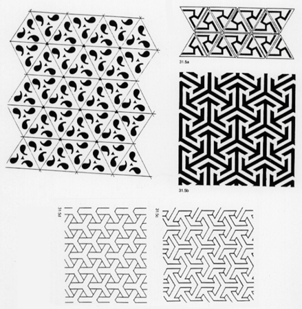
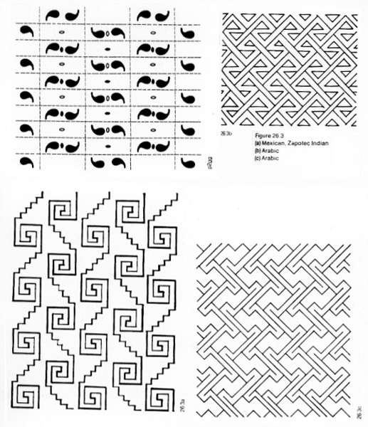
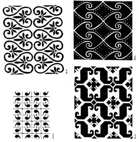
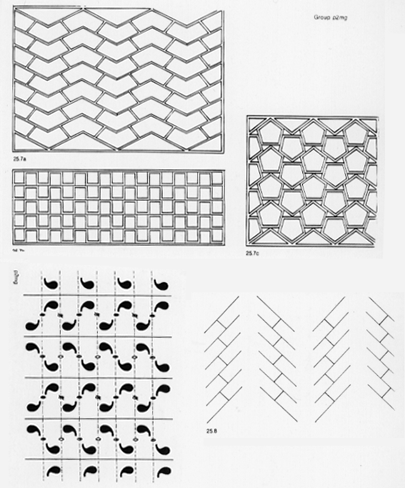
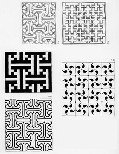
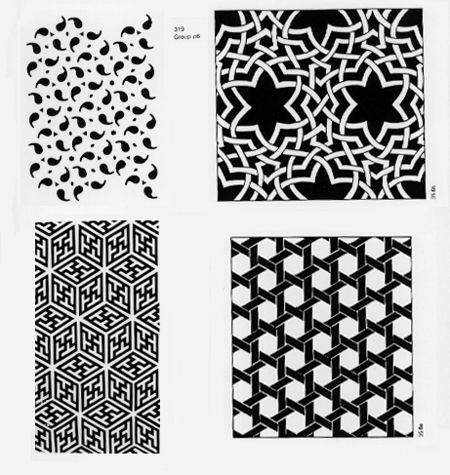
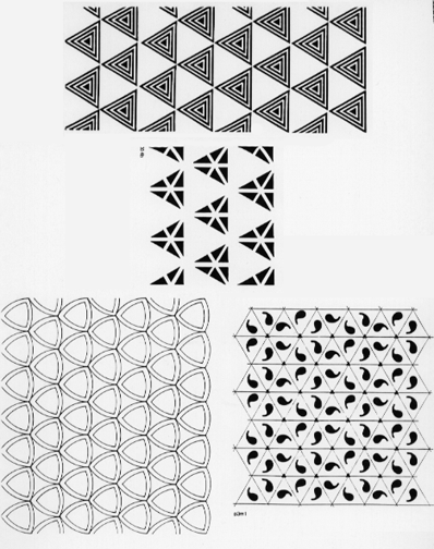
Review of symmetry groups in pattern.
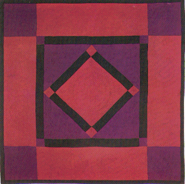
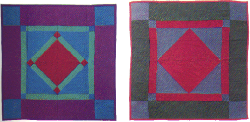
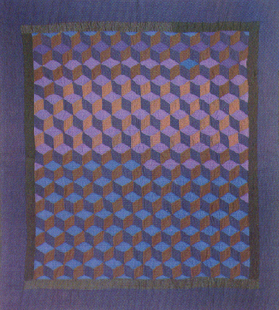
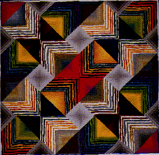
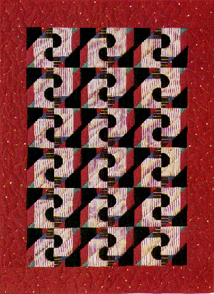
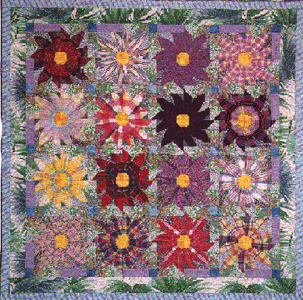
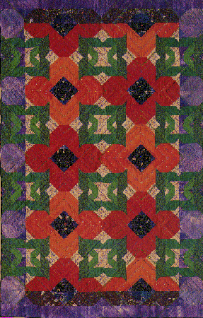
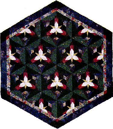
Amish Quilts Observe the exploration of color interaction through the use of geometric shape in the quilting art of naive Amish artists.
Good Books, Intercourse, Pennsylvania 17534, 1984 Fig 20, 21, 22, p.17
Fig 168, p.85
Gradations From the Studio of NANCY CROW, p.39
Musical Notation Quilt, p.91
Painted Daisies Quilt, p.92
Poppies Quilt, p.94
Trillium Quilt, p.106
Displaying p4, p4mm, p4gm, p3, p6 symmetries
What sorts of symmetries do you see here in Albers work, in quilting?
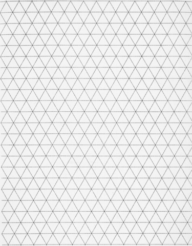
construct a symmetry group with asymmetric motif

1. Create an asymmetric motif on your graph paper that measures approximately one to two inches wide and/or long. 2. Use your assigned symmetry group to put the motif in repeat on the graph paper. Experiment with the motif and the symmetry group using tracing paper so that it can repeat in an intriguing way. 3. Draw enough repeats to get a sense of the planar pattern -- about 8-12 repeats across and down on your graph paper. The amount of repeats needed will depend on both your motif and symmetry group. Try to complete as much as possible before the end of class.
Home work for 3- and 6-fold symmetry designs
Goal
Paint an effective pattern design using:
GOAL:
From Benjamin Martinez, Jacqueline Block: "VISUAL FORCESAN INTRODUCTION TO DESIGN" Prentice-Hall, Inc., 1988Please read the following before beginning assignment 4
Color Interaction
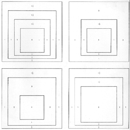
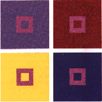
We have seen how a gray appears to change dramatically when we alter the value of the field upon which it sits (Fig. A on page 172). An even more complicated pattern of interactions exists for color, with its many properties. The hue, value, intensity, and temperature of a color area are all affected by color interaction. In Fig. A a single, fairly neutral color is placed in four different color fields, and it changes its guise each time. Color interaction can make a single color appear hotter, cooler, lighter, darker, redder or bluer than it is. These color changes occur whether we want them to or not, so it is critical for artists and designers to understand just how colors interact and to anticipate those interactions. It is frustrating (and sometimes expensive) to mix a perfect tone for a particular purpose only to discover that it becomes a different color when applied to a white canvas or illegible when printed on green paper. The Italian Renaissance painter Titian must have recognized the importance of knowing how to manipulate the appearance of color when he bragged, as he supposedly did, that he could use mud to paint the flesh of Venus. What he meant was that if he could get a muddy, low intensity color into the right relationship with surrounding values and colors, it would appear luminous, brilliant, and rich. Probably the best-known systematic investigation of color interaction is found in the series of paintings by Josef Albers called "Homage to the Square." Albers chose the square as the most neutral format, neither too high nor too wide. He did not mix colors for these paintings, but used them straight from the paint tube, applying them smoothly and evenly and making sure that no blank strip separated one color from another. There are no complex compositions in the series, and the square format of the outside is echoed within. Still, there is plenty to look at and work with. The size of the interior squares, the widths of the bands they create, and the hue, value, intensity, and temperature differences resulted in distinct and varied color personalities and kinds of light from one painting to another. A painting based on variations of orange might glow like a kiln. The opposition of blue and white might create the open and airy feeling of a Mediterranean landscape. Color might be made to feel compressed or expansive, edges made to seem crisp or dissolved (Figs. B and C).
B
Figure B. Josef Albers, "Homage to the Square: Silent Hall." 1961. (Collection, The Museum of Modern Art, New York; Dr. and Mrs. Frank Stanton Fund) Figure C. Josef Albers, "Homage to the Square: Apparition." 1959. (Collection, Solomon R. Guggenheim Museum, New York)
Color Interaction: Simultaneous Contrast
The effect, furthermore, is modified or enhanced by the particular colors chosen. Pure, intense, primary hues are not much affected by context, but lower-intensity colors and colors that are not primary or spectral can change appearance radically. Size can also influence the effect of simultaneous contrast. Generally, larger color areas have more influence on smaller color areas. The small green square is changed by the color of the yellow or blue field, not the reverse. This is why colored type seems to be affected by the color of the ground and not the reverse, or why a red thread running through a green cloth looks so brilliantly red. Although we are usually not conscious of this "optical illusion," it is something we continuously experience in our ordinary perception of things. We do not see it happen unless it is presented in diagramatic form as in the figures here. The effect of simultaneous contrast is only interesting to the viewer of a work of art or design, but absolutely critical to its maker.
|
|
| < - Previous |Next - > | |  |


 We have noted repeatedly that there
is no such thing as a single and isolated color. Colors are always seen next to
other colors. Even a colored dot on a sheet of paper will interact with the color
of the paper-say, bright or dull white, buff, gray-and the two colors will change
each other to some degree. When we speak of a color's hue, value, and intensity,
we are describing that color in an imaginary void; when the color is placed in a
context of surrounding colors, everything is changed.
We have noted repeatedly that there
is no such thing as a single and isolated color. Colors are always seen next to
other colors. Even a colored dot on a sheet of paper will interact with the color
of the paper-say, bright or dull white, buff, gray-and the two colors will change
each other to some degree. When we speak of a color's hue, value, and intensity,
we are describing that color in an imaginary void; when the color is placed in a
context of surrounding colors, everything is changed.
 C
C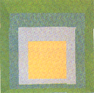
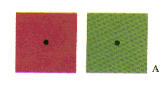 We have already noted the effect of afterimage, the ghostly image of a color's
complement that one sees after staring at a color spot. When we look at colors
that are next to one another, something similar happens. A black dot placed on a
red field will look greenish, and placed on a green field it will look reddish
(Fig. A). The color of the field (say, red) will "call forth" its opposite
quality (green) in a black dot placed upon it. This is something that happens in
your eye and not on the page; if you peeled off the black dots, they would still
be black. If you wanted the black dot to look black on a red field, you would
most likely have to make it a very dark red to compensate for the ghostly aura of
green.
We have already noted the effect of afterimage, the ghostly image of a color's
complement that one sees after staring at a color spot. When we look at colors
that are next to one another, something similar happens. A black dot placed on a
red field will look greenish, and placed on a green field it will look reddish
(Fig. A). The color of the field (say, red) will "call forth" its opposite
quality (green) in a black dot placed upon it. This is something that happens in
your eye and not on the page; if you peeled off the black dots, they would still
be black. If you wanted the black dot to look black on a red field, you would
most likely have to make it a very dark red to compensate for the ghostly aura of
green.
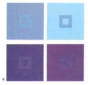 We call this effect in adjacent colors simultaneous contrast. The principle
applies to all such interactions. A color will appear darker in value on a light
ground and lighter on a dark ground, more intense on a more neutral ground and
grayer on a very intense ground (Fig. B). Green will look more yellow on a field
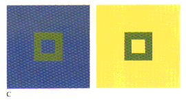
of blue and more blue on a field of yellow (Fig. C).
We call this effect in adjacent colors simultaneous contrast. The principle
applies to all such interactions. A color will appear darker in value on a light
ground and lighter on a dark ground, more intense on a more neutral ground and
grayer on a very intense ground (Fig. B). Green will look more yellow on a field
of blue and more blue on a field of yellow (Fig. C).