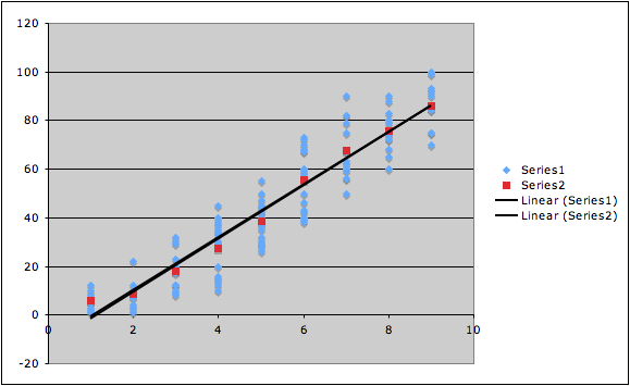
Graph of averages regression line
See txt or xls file for full data set.
| x | avg y | |
| 1 | 5.9 | |
| 2 | 8.45 | |
| 3 | 17.85 | |
| 4 | 27.38 | |
| 5 | 38.65 | |
| 6 | 55.75 | |
| 7 | 67.77 | |
| 8 | 75.55 | |
| 9 | 86.2 |
| full data set | averages data set | |
| 0.93 | correlation coefficient | 0.99 |
| 5 | mean of x | 5 |
| 42.2 | mean of y | 42.6 |
| 2.3 | SD of x | 2.6 |
| 27.5 | SD of y | 28.2 |
Scatterplot of each set (original data in blue, averages in red) with both regression lines. Note that while it is clear they aren't identical, they are extremely similar. This is because the change in r from this ecological correlation has been counterbalanced by the changes in the other statistics that go into the regression line's equation.